The first Asahi sample I posted was not a whole frontpage, but a clipped article layered on top of the frontpage (to show the publishing date of that article). Sorry about that inaccuracy.
Some samples of real life headline styles. Of course, how to handle the in-game newspapers are an
entirely separate issue from the game's main UI fonts.
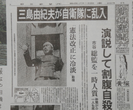
Asahi Shimbun Evening frontpage, reporting on the suicide of Yukio Mishima.
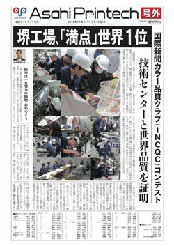
Frontpage of a tech news extra.
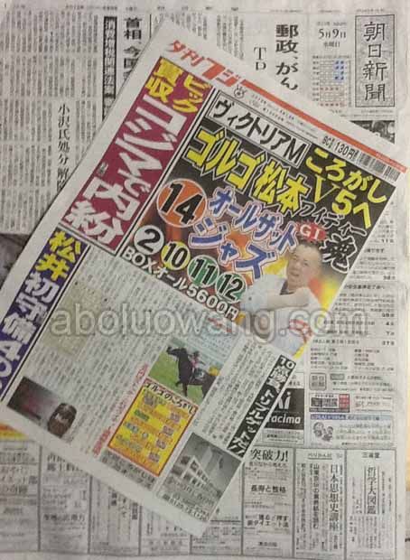
Those headline styles are seen in a serious newspaper; the tabloids are much louder. Here's a comparison between frontpages of Asahi Shimbun and Fuji Evening News, Japan's No.1 tabloid:
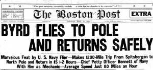
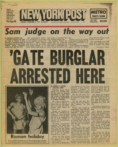
For sans serif fonts in newspaper headlines, a quick search gets me these 20th century American examples:
I always see the newspaper headlines as a comparatively later goal, since there are nontrivial tasks of translation and rewriting involved. It's better for the headline style to be determined after they are all translated, so we can know what are the limits of headlines (longest, shortest, handling of wordplay, etc).
================
RE: Practice menu (Ciel's work below):

- Is it acceptable to shorten "Fast Spirit Recovery" to "Fast Spirit"/"Faster Spirit"/"Rapid Spirit"? In Ciel's sample, the spacing between "Spirit Recovery" and "KeyF4" is still too narrow. Or are there any better ideas?
- Ciel's other word choices - "2P Movement", "2P Play" and "Tech Direction" are good. Approved.
- It's infeasible to require Practice menu items to all have the same cutoff point as I previous said. English text also looks better when the letters are in the same proportion, unlike in Japanese, where keeping items in a column at the same span may look better.
================
Currently, I'd like someone to help test the following:
- Using an italicized URW Imperial font (download link
here, more variations on other pages) for UI help text (all those PNG files named "
explain"), and still keeping it as readable as possible. It's always bad form to change italicized text to non-italicized text, but readability is a concern.
- Using Mercury Text for system menus (download link
here, more variations on other pages). At least for system menus, Mercury Text is a lot closer in style to the original than Times New Roman.