Author Topic: My New Doujinshi - Use Your Illusion (COMPLETE)  (Read 14438 times)

Sixten

  • Legendary Creature - Frog
  • 6/10
    • House of Sixten
My New Doujinshi - Use Your Illusion (COMPLETE)
« on: March 05, 2013, 05:29:35 AM »
So as not to clutter the Post Your Artwork thread, I have made a new thread for the Youmu x Reisen book I am making, Use Your Illusion.

I'll update this first post with the pages as I complete them.


Full size cover: http://www.houseofsixten.com/stealth/cirno/illusion/page000.jpg

Edit April 8: Added Pages 03-04

Page 01
Page 02
Page 03
Page 04

Edit October 20: Finished first half. Link is below.

Use Your Illusion 1 (on my website)
Use Your Illusion 1 (on Pixiv)

Edit January 27: Finished all.

Read on House of Sixten
Read on Pixiv
« Last Edit: January 27, 2014, 02:22:47 PM by Sixten »

pineyappled

Re: [Art] My New Doujinshi In Progress - Use Your Illusion
« Reply #1 on: March 05, 2013, 05:57:52 AM »
There's nothing, absolutely nothing, wrong with hand-lettering. I would use it more if my handwriting wasn't total rubbish. You can even make your own handwritten font if you feel like it.
Handwriting is always,  always better than computer lettering. Provided it's legible, of course.

Sixten

  • Legendary Creature - Frog
  • 6/10
    • House of Sixten
Re: [Art] My New Doujinshi In Progress - Use Your Illusion
« Reply #2 on: March 05, 2013, 02:52:02 PM »
Okay, here's the first page with all the text in handwriting. Does it look better?
http://www.houseofsixten.com/stealth/cirno/illusion/page001_hr.jpg

Incidentally, this title is also handwritten:
http://www.houseofsixten.com/stealth/cirno/lunasa/page000_small.jpg

Re: [Art] My New Doujinshi In Progress - Use Your Illusion
« Reply #3 on: March 05, 2013, 03:40:29 PM »
Oh gods. It feels like a stylised Comic Sans font. Lmao.

Still better than before, though.

By the way, I can't help but notice that everyone...looks like children? Is that intentional?

Vento

  • Playtime is over!!!!
  • *
  • TRIGGER WARNING : #2handsome5casuls
Re: [Art] My New Doujinshi In Progress - Use Your Illusion
« Reply #4 on: March 05, 2013, 04:17:41 PM »

much much better
Distasteful Tater Elites 1st division

Nicole Artist

  • Eat egg
  • *
  • egg egg egg egg
    • Tumblr
Re: [Art] My New Doujinshi In Progress - Use Your Illusion
« Reply #5 on: March 05, 2013, 05:03:29 PM »
Heh wow these are pretty beyond fantastic.
Yuyukos an old hag :V
My only complaint is the excessive use of horizontal lines hurts my eyes. Like, try dots, or something. Variety.

Re: [Art] My New Doujinshi In Progress - Use Your Illusion
« Reply #6 on: March 05, 2013, 08:03:57 PM »
OMG must buy  doujinshi on my list
it would be fun if we can trade our doujinshi in a convention~
i like the way how u color ur background, so awesome :3
I wonder what makes Youmu quit her job :(
Handwriting is always,  always better than computer lettering. Provided it's legible, of course.
I half-agreed what Kinoko said
handwriting might not always be better than computer lettering depending on the situation
but in your title page
mechanical text doesn't rly fit the atmosphere of ur title page
the text seem to be too bold and hard corner
It feels like the text is trying command the viewer
and the composition of the text kinda framed the whole image
the whole title feels like a uncle sam poster in my point of view
I could be wrong but I suggest to find some font that is more humanist
I kinda went ahead of myself and made quick adjustment as an example

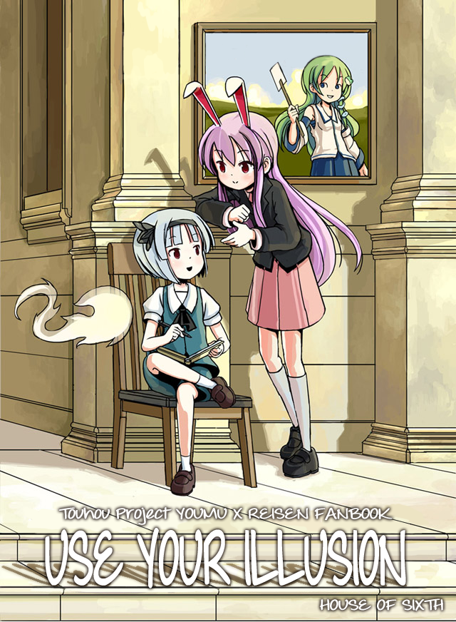
the text still seem to be a bit mechanic but it has a different feeling compare to the bold hard corner text
again this is just an example for suggestion, and I apologize that I used ur work |OAO>
would like to see it complete and we can trade doujinshi |OwO>

pineyappled

Re: [Art] My New Doujinshi In Progress - Use Your Illusion
« Reply #7 on: March 05, 2013, 11:27:42 PM »
Okay, here's the first page with all the text in handwriting. Does it look better?
http://www.houseofsixten.com/stealth/cirno/illusion/page001_hr.jpg

Incidentally, this title is also handwritten:
http://www.houseofsixten.com/stealth/cirno/lunasa/page000_small.jpg
Better!

Sixten

  • Legendary Creature - Frog
  • 6/10
    • House of Sixten
Re: [Art] My New Doujinshi In Progress - Use Your Illusion
« Reply #8 on: March 06, 2013, 04:52:39 AM »
Okay, here's a new page taking people's suggestions into account:

- Handwritten letters are now wider to lessen the similarity to Comic Sans
- Horizontal line screentone has been replaced with dots screentone

http://www.houseofsixten.com/stealth/cirno/illusion/page001_hr2.jpg

@Freeze-Ex: While I appreciate your suggestion, I have to disagree with your font choice.

The font I chose might not be correct, but I do want something tall, narrow, and mechanical.

And if you want to exchange books, it might take a while for Use Your Illusion to be completed. I can get you copies of the books I already have completed:
Fairy Ring: http://www.houseofsixten.com/hcstaff/?p=2743
Autumn Children: http://www.houseofsixten.com/hcstaff/?p=3271

Where can I find your books, anyway?

@NotaPirate: My style tends to make all characters look like children. It does seem out of place for characters who are supposed to have finished school and started day jobs, but oh well.
« Last Edit: March 06, 2013, 04:55:35 AM by Sixten »

pineyappled

Re: [Art] My New Doujinshi In Progress - Use Your Illusion
« Reply #9 on: March 06, 2013, 05:03:30 AM »
It never looked like Comic Sans, though? Still, I'm liking the wider spacing and the screentones.

Re: [Art] My New Doujinshi In Progress - Use Your Illusion
« Reply #10 on: March 06, 2013, 07:30:17 AM »
meh u don't need to take my suggestion anyway
the font choice sometime rly more like a personal preference
sometime I just take it too technical sry about that |QAQ>
I published 2 doujinshi but they all sucks lol
the demo can be seen on my art thread
I will like to wait till I finish my recent doujinshi for C84
since we both need time to finish the doujinshi
I am sure we can wait |OwO>/

Mеа

  • catnapping
  • three dots connect to rectangles
Re: [Art] My New Doujinshi In Progress - Use Your Illusion
« Reply #11 on: March 06, 2013, 07:58:11 AM »
Hey, amazing stuff you've got going on here. Keep it up!
And those new dot screentones are so much easier on the eyes.
Naked expression; purple raspberry flavour

Jq1790

  • Wow I'm back to playing this game.
  • Let's puzzle together again, Karin!
Re: [Art] My New Doujinshi In Progress - Use Your Illusion
« Reply #12 on: March 06, 2013, 02:25:15 PM »
Also seconding the approval of dot screentones.  I didn't mind the old ones, but the new ones are certainly better.  Also liking the new handwriting- it feels like it meshes even better with your art style, I think.
If you're a Pazudora player and aren't on #puzzleandlibrarians, come join us!

Nicole Artist

  • Eat egg
  • *
  • egg egg egg egg
    • Tumblr
Re: [Art] My New Doujinshi In Progress - Use Your Illusion
« Reply #13 on: March 07, 2013, 02:19:47 AM »
Oh yes I can read it without pain now
what would be really cool is if you could get different sets of dots, like some farther appart, some closer, to create different sort of grey tones, to differently color different areas

Sixten

  • Legendary Creature - Frog
  • 6/10
    • House of Sixten
Re: [Art] My New Doujinshi In Progress - Use Your Illusion
« Reply #14 on: March 08, 2013, 04:28:13 AM »
Okay, replaced the two pages so far in the first post of the thread, with the hand-lettered, dot screentone version. Hoping to get the third page done before Monday (March 11).

Sixten

  • Legendary Creature - Frog
  • 6/10
    • House of Sixten
Re: [Art] My New Doujinshi In Progress - Use Your Illusion
« Reply #15 on: April 08, 2013, 01:39:53 PM »
Well that took a while. Anyway, see here for why I stopped and why I started again.

You may note that the font has reverted to the font used in Autumn Children and the screentones have dropped off. This is because my publisher is going to handle the typesetting and help with the screentones, so I'll draw everything first and worry about the fonts and tones later.

Added pages 03-04 to the parent post.

Page 01
Page 02
Page 03
Page 04

pineyappled

Re: [Art] My New Doujinshi In Progress - Use Your Illusion
« Reply #16 on: April 08, 2013, 03:09:26 PM »
Eirin doesn't look nearly evil enough.

Kaze_Senshi

  • Ehhhhh...
  • Pale Apple
    • My youtube channel
Re: [Art] My New Doujinshi In Progress - Use Your Illusion
« Reply #17 on: April 11, 2013, 11:01:55 AM »
"I hired you, shut up and work"
Bosses always have excellent arguments to make you work :V
My youtube channel with my creations: https://www.youtube.com/user/KazeSenshi2929
( ゆっくりしていってね)>

Jq1790

  • Wow I'm back to playing this game.
  • Let's puzzle together again, Karin!
Re: [Art] My New Doujinshi In Progress - Use Your Illusion
« Reply #18 on: April 11, 2013, 11:56:39 PM »
Oh wow, poor Reisen.  Ah well, that's Eirin for you, right?  Looking forward to continuing to follow this!
If you're a Pazudora player and aren't on #puzzleandlibrarians, come join us!

Alfred F. Jones

  • Estamos orgullosos del Batall?n Lincoln
  • *
  • y de la lucha que hizo por Madrid
Re: [Art] My New Doujinshi In Progress - Use Your Illusion
« Reply #19 on: May 27, 2013, 11:02:15 PM »
I just now noticed that Reisen's ears aren't crinkly and floppy, they're standing up way more. I'm guessing that's deliberate.

Busy playing HM or DDC? I ask because I'm hoping you're still working on this, it is really nice.

Sixten

  • Legendary Creature - Frog
  • 6/10
    • House of Sixten
Re: [Art] My New Doujinshi In Progress - Use Your Illusion
« Reply #20 on: May 28, 2013, 12:41:18 AM »
I'm busy with backgrounds for the Scroll Project and with invitations for my brother's wedding. I should be able to resume work on this in July at the latest.

Stuffman

  • *
  • We're having a ball!
Re: [Art] My New Doujinshi In Progress - Use Your Illusion
« Reply #21 on: May 28, 2013, 02:12:09 AM »
I think you should work on putting more emotion into your character's faces.


There's very little difference in any of these; only the position of the eyebrows change, or maybe eyelids going up or down a little. The mouth is identical in every frame, and for someone who hasn't had a day off in who knows how long, her face doesn't show any weariness.

While your inking style is extremely clean and sharp, I think it might be making it hard to retain more organic details that would lend more character to one's expression.

Sixten

  • Legendary Creature - Frog
  • 6/10
    • House of Sixten
@Stuffman: You make a valid point. I don't think I'm quite there yet, but I've made an effort to make the rest of the expressions in the first half have more variety.

First half complete!


Anyway, I've finished the first half of the book. Go check it out in the link below and let me know what you think.

Use Your Illusion 1 (on my website)
Use Your Illusion 1 (on Pixiv)
« Last Edit: October 21, 2013, 08:24:50 AM by Sixten »

pineyappled

Might want to put it in a format that's a bit easier to read? It's a pain to keep opening and closing tabs...

Sixten

  • Legendary Creature - Frog
  • 6/10
    • House of Sixten
@kinoko: You can read it on Pixiv.

Vento

  • Playtime is over!!!!
  • *
  • TRIGGER WARNING : #2handsome5casuls
the flow in page 13 and 4 especially is really awkward, needs more in-between frames

also is there a reason of the lack of screentones, reading it becomes a little jarring after a while eg. page 6
« Last Edit: October 21, 2013, 08:53:25 AM by Vento »
Distasteful Tater Elites 1st division

Sixten

  • Legendary Creature - Frog
  • 6/10
    • House of Sixten
My Doujinshi - Use Your Illusion (Complete)
« Reply #26 on: January 27, 2014, 02:21:14 PM »
@Vento: The lack of screen tones is a time issue - I had to submit my book to the publisher yesterday and there was no time to add screen tones. I agree that the lack of screen tones is a problem, particularly since the entire story takes place at night and it's hard to convey that without screen tones or hatching (which would take as much time as adding the screen tones). Part of the problem is me not being fast enough to draw a 40-50 page book in a six-month season (approx. 16 hours a week) without cutting corners.

It's too late to change my book now, but I will definitely use the screen tones in the future. I will have to make my future books shorter (and cut down on the use of gratuitous perspective) until my speed improves.

Your comment about the bad transition on certain pages is also true. There's another bad transition in the second half when Sanae appears, which came about from trying to fit too many events on one page and having to cut some. When I do my next book, the shorter length will allow me to spend more time on the script and layout to avoid these bad transitions.

As for the font used in the speech bubbles, my publisher handles the typesetting. If any of you have seen the print version of my books, you would know that they use a much nicer font than what ends up getting posted online.

Anyway, my book is now complete.

Use Your Illusion (Youmu x Reisen) - Spring 2014
Read on House of Sixten
Read on Pixiv

Tengukami

  • Breaking news. Any season.
  • *
  • I said, with a posed look.
Re: My New Doujinshi - Use Your Illusion (COMPLETE)
« Reply #27 on: January 27, 2014, 03:07:49 PM »
Congrats on finishing your project! That's more than a lot of people can say. More importantly, I think this is already a semi-professional effort and, with some minor adjustments (transitions, what Stuffs pointed out about facial expressions, the flow of dialogue), all I know is I look forward to your next effort as well. Thanks for sharing this with us.

"Human history and growth are both linked closely to strife. Without conflict, humanity would have no impetus for growth. When humans are satisfied with their present condition, they may as well give up on life."