Gah, so tired... I'll try to sound as coherent as I can muster...
Practice menu (and menus in general) :
The only parts of the menu that were troublesome were the Spirit Recovery and 2P Control options. I don't think 2P Height is the correct way to word it, either; if someone could suggest better wording, that would be great.
which font are you using in this one?
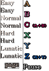
The items you are not sure about are "Fast Spirit Recovery" and "2P Behavior". The options for "2P Behavior" are: "Normal", "Move Up", "Move Down", "Com" and "2P Control". Also, all those options you wrote as "On/Off" are better as "Yes/No", and the last option for "Guard" is "Only Once". (You can also look up the menu translations at
http://shinkirou.koumakan.jp.)
For "Fast Spirit Recovery", you probably have to squeeze the letters, and shorten it to something like "Fast Spirit Regen./Recov."
Also note two differences between your work and the original:
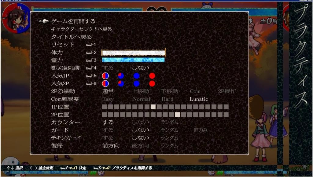
1. In the original, there is a relatively constant cutoff point for the item names, so there is a space between "Recovery" and "KeyF4", while the items below the hotkey names also don't exceed this cutoff point. This looks nicer.
2. You have not edited the difficulty options, so they are now in a different font from your whole menu.
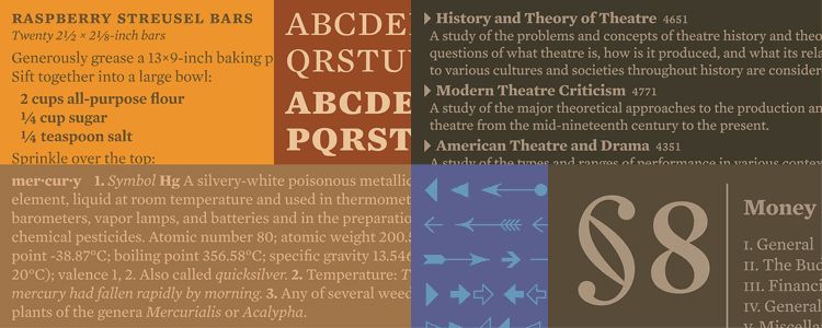
It's called URWImperial. I'm using it for different things in mine.
You are using URWImperial for the help text at the bottom? They look good,
Have you tested using italicized help text? Granted, italicized help text sounds like a terrible idea in English...
Next post:
explanation, ideas...
EDIT:
Can you suggest any English fonts that are similar in style to those in the original menus? They don't have to be in the same width/height proportion - Tasofro may have stretched those letters wider than they normally are.
Another example, from the game manual:

I'm still leaning toward using the Mercury Text family for the menus. It's not similar, but it's a beautiful font. (
Download)